An unofficial urban history and resource archive related to
St Kilda Junction, Melbourne,
Australia

 By Christopher Cody
From the beginning, St Kilda Junction was a gateway to St Kilda and the surrounding area. Its early life from the 1840s was a time of steady but dramatic change....
 By Christopher Cody
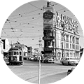
St Kilda Junction by the 1900s had long been transformed into an urban environment. The smell of eucalyptus after rain, the sounds of squawking flocks of water...
 By Christopher Cody
A cursory survey of newspaper articles suggests that the Junction was a dangerous place with many accidents and fatalities...
 By Christopher Cody
During the 1950s and into the 1960s St Kilda became more and more impoverished and its infrastructure increasingly 'run-down'....
 By Christopher Cody
When I first came to live in Melbourne in the mid 1980s, St Kilda Junction was one of the first places I used to orientate myself around the city. At this time on the corner of St Kilda Road and...
 By Christopher Cody
In 2006 the City of Port Phillip instituted a street art project at the Junction not without some local criticism.1 The motivation for the project may have derived from a range of factors such as;...
 By Christopher Cody
In 1929 a 'crows-nest' control box (Signal Box) was installed at the Junction on the corner of Wellington Street to manage the trams running through the Junction.1 This little control box was a...
By Christopher Cody 
By Christopher Cody 
By Christopher Cody Documentation and examples for Bootstrap typography, including global settings, headings, body text, lists, and more.
Display 1
Display 2
Display 3
Display 4
Display 5
Display 6
This is a lead paragraph. It stands out from regular paragraphs.
You can use the mark tag to highlight text.
This line of text is meant to be treated as deleted text.
This line of text is meant to be treated as no longer accurate.
This line of text is meant to be treated as an addition to the document.
This line of text will render as underlined.
This line of text is meant to be treated as fine print.
This line rendered as bold text.
This line rendered as italicized text.
Provide contextual feedback messages for typical user actions with the handful of available and flexible alert messages.
Documentation and examples for badges, our small count and labeling component.
Example heading New
Example heading New
Example heading New
Example heading New
Example heading New
Example heading New
Example heading New
Example heading New
Use Bootstrap’s custom button styles for actions in forms, dialogs, and more with support for multiple sizes, states, and more.
Bootstrap’s cards provide a flexible and extensible content container with multiple variants and options.
Some quick example text to build on the card title and make up the bulk of the card's content.
Go somewhereThis is a wider card with supporting text below as a natural lead-in to additional content. This content is a little bit longer.
Last updated 3 mins ago
Cards include various options for customizing their backgrounds, borders, and color.
Some quick example text to build on the card title and make up the bulk of the card's content.
Some quick example text to build on the card title and make up the bulk of the card's content.
Some quick example text to build on the card title and make up the bulk of the card's content.
Some quick example text to build on the card title and make up the bulk of the card's content.
Some quick example text to build on the card title and make up the bulk of the card's content.
Some quick example text to build on the card title and make up the bulk of the card's content.
Some quick example text to build on the card title and make up the bulk of the card's content.
Some quick example text to build on the card title and make up the bulk of the card's content.
Documentation and examples for using Bootstrap custom progress bars featuring support for stacked bars, animated backgrounds, and text labels.
Indicate the loading state of a component or page with Bootstrap spinners, built entirely with HTML, CSS, and no JavaScript.
Documentation and examples for showing pagination to indicate a series of related content exists across multiple pages.


